Welcome to the Mansion of Doom
Hello, here i am again with another devlog. It sure has been awhile hasn't it? This log comes with an update, the biggest update yet. The game design document has been fully completed and work on the actual art, music and coding has resumed. I am going to go through each addition to the game in this update and show what has changed, what is still to change and compare to older versions if they exist.
So let's start at the beginning, the title screen. One update to this, there is now some music. Audio has been added to the whole update but this is the first song you here. All songs are currently placeholder music and may change in the final version, though some may stay as they are. Other than the music there is a slight change to the actual title screen graphics, some very slight graphical improvements, though this will continue to be added to and improved with each update.
After the title screen and upon clicking on new game an opening cutscene plays. This cutscene is very early in development and will undergo many improvements in future versions but I wanted to include it to show why you are in this mansion and just to set the groundwork for the future. All the animations and backgrounds will be changed in the next update but it serves it's purpose for now.
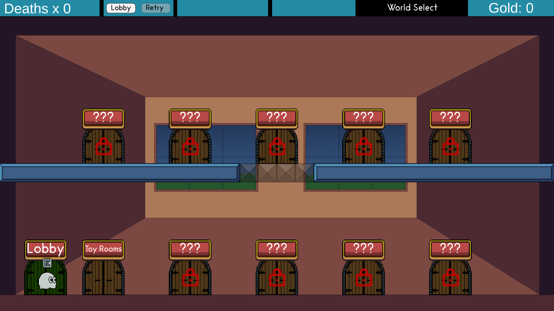
Next change is a fairly big one, the game now has a world select scene (seen below). This is a room that allows the player to enter each world. Worlds are locked until you have completed the previous world. When the player is in front of a door an E icon shows above the players head to indicate that player can interact with the doors. The background and door sprites are still all placeholders as each world will have a unique door sprite but it works functionally.
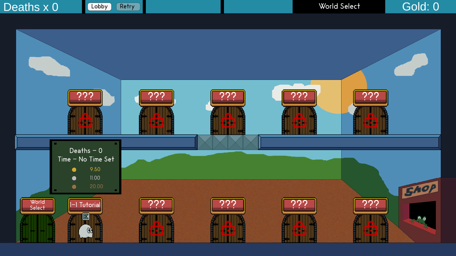
Another new scene is the level select scene (seen below). This has a similar layout to the world select scene with one exception. When the player is in front of one of the level doors a box will appear above the door. This UI element shows how many times the player has died in this level total and the fastest time the player has completed this level in. Below that there are three more times next to a medal. These times show how fast the player must complete this level to achieve the corresponding medal (being gold, silver and bronze). This adds some replayability to the levels for those that care about getting the gold medal for each level. There is also a shop that has been added to the level select scenes, it allows the player to buy certain items using the gold they collect in the game.
The dialogue box has been changed. The old placeholder background has been changed to a much better looking background. I wanted to keep the dialogue box design simple so I went with a blue gradient background with a thick white border and white font. I think this looks good and I am happy with how this looks. 

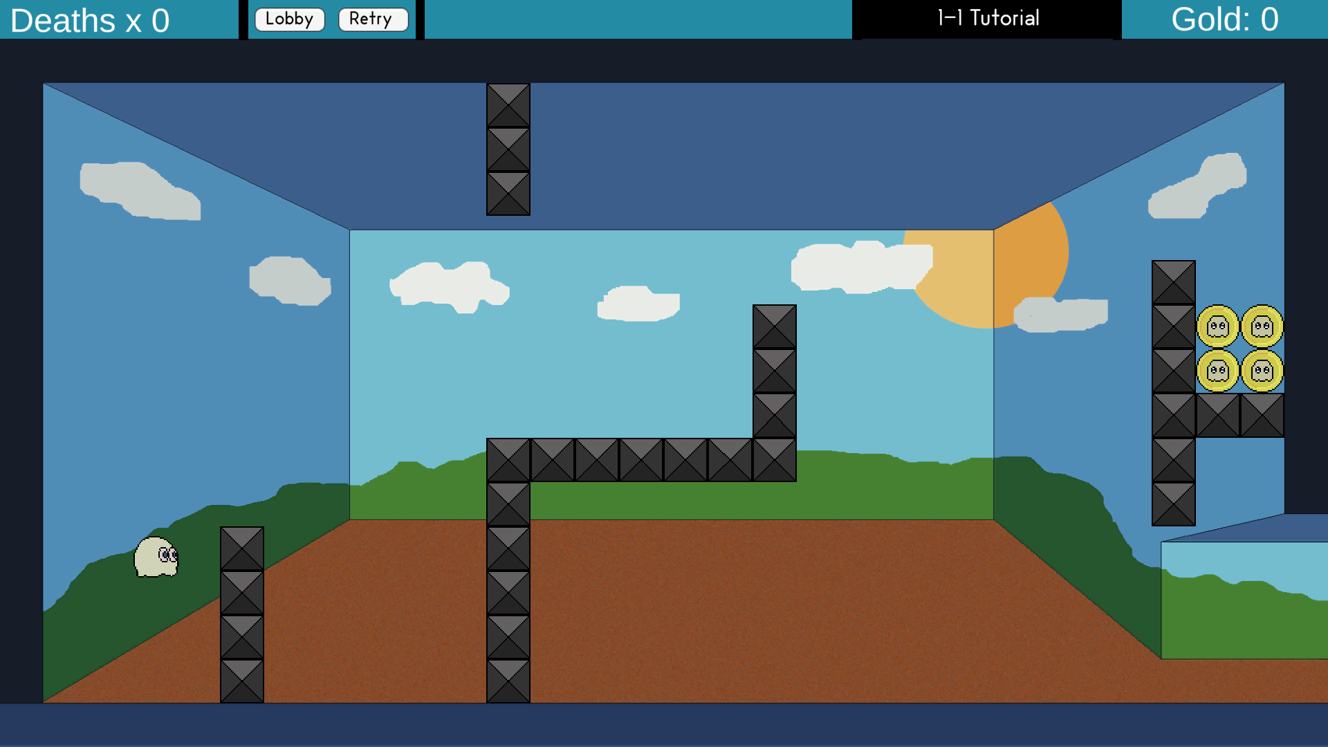
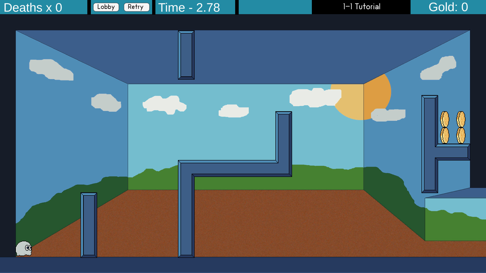
Another quite big visual change is to the walls in the levels. In the old version they were all individual 32 x 32 sprites. This didn't look right to me so I decided to make a new tileset in Unity so I can create fluid walls that I could easily paint in any level. Unity has a built in tileset system but there is an additional package you can install called a rule tile. This allows you to determine how each tile in the tileset should be placed in relation to where other tiles are around that tile. This takes a little bit of fiddling to get it all right but it speeds up development in the long run as it makes it easier to create walls that tile perfectly by just drawing it in the scene instead of manually placing each wall object.
Additional audio has been added to all current scenes. Each scene now has music playing with each one having a different theme.
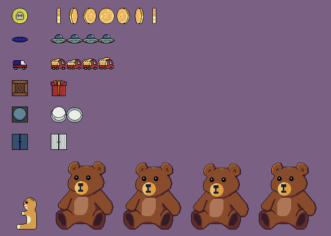
Each enemy, item and object in the first world, the toy tooms has been updated. They all have better looking sprites and animations where appropriate. You can see the comparison of the old and new sprites below.
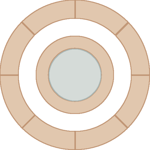
A new power system has been implemented. The previous system was each new power being set to a different key. This system had severe limitations and not what I wanted from the powers you can gain during the game. So I created a new 'power wheel' system. After you have obtained a power you can hold down the Q key and a wheel UI element will appear onscreen. You can move the mouse above an icon and information about that power will be displayed, by clicking the icon that power will now be equipped. You can use your equipped power by pressing the F key.
The boss the of the first world, big bear has been completely revamped. It now has animations and feels much more like a boss than how the old fight felt. The boss fires objects at the player using a cannon and gets hurt when a football bounces back at him. This causes the bear to pause the attacks shortly before starting again, slightly faster. The fight ramps up nicely before the final hit sees the bear fire its cannon fast at the player. I'm happy with how this fight feels now (though play testing is needed to see if this is too hard for the average player).
And I think that's about it. There may be some things I have missed as there was so much new stuff. I plan to do more regular updates in the future so the dev logs aren't as long and less chance of forgetting things.
I now move on to some art work, making better starting cutscenes and working on the backgrounds for the worlds I currently have fully coded. Then it will be moving on to implementing each world and its objects, items, enemies and bosses.
I'm incredibly happy with how this project is shaping up and will continue to work on it, I'm really getting in to pixel art but know I still have a lot to learn. Look forward to more frequent updates and I will see you in the next one, peace!
Files
Mansion of Doom
| Status | In development |
| Author | Michael Wolf |
| Genre | Action |
More posts
- An actual update!Jul 30, 2024
- Lack of UpdatesFeb 15, 2024
- Overdue updateOct 21, 2023
- Teething problemsSep 28, 2023
- Enter the MansionSep 27, 2023
Leave a comment
Log in with itch.io to leave a comment.